
Ghost of Tsushima was well-regarded by players and critics from all over the world thanks in large part to how it depicted its setting of Tsushima island in Japan. With sequel Ghost of Yōtei now being a little over a week away, art director Joanna Wang has spoken in an interview with Automaton Media about how the upcoming title will carry over some of the original’s cultural foundations while still depicting a brand new region—Hokkaido.
“Many things,” said Wang when discussing how much of Ghost of Tsushima will carry over into Ghost of Yōtei despite both games taking place across different time periods and regions. “Some cultural foundations remain the same, and we were able to expand on the knowledge we gained while making Ghost of Tsushima, with the help of advisors guiding us through the Hokkaido setting.”
“Visually, we’ve kept the “living painting” look, inspired by the minimalism of Japanese art. By stripping away distractions, the main themes stand out more clearly, while details enrich the world. This idea comes from Japanese art and culture, and it continues to shape the style of Ghost of Yōtei.”
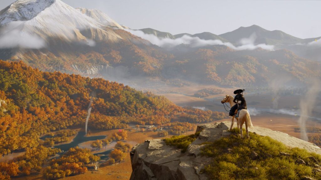
Wang also spoke about the change in art direction we see in Ghost of Yōtei, which, when compared to its predecessor, has a brighter colour palette. She explained that the sequel will explore a land that is meant to feel remote, vast and untamed. Each region in the new map will also be differently designed, regions all having different seasonal feels, their own colour palettes, and personalities.
“The landscape stretches endlessly in every direction, both horizontally and vertically, Wang explained. “It feels more dramatic, more vibrant, and more alive than Tsushima, and that’s how we wanted to depict it. For example, you might see the aurora crossing the night sky, or when the Sun rises, you’ll see clouds drifting over the mountains as birds take flight and the wind sweeps across the grass fields. It makes you feel like the land is raw, wild and unpredictable, yet alive.”
“The map itself is designed very differently from Tsushima. Each region has its own personality, a different seasonal feel, and its own colour palette. All of this helps players immerse themselves in the world and enjoy it even more.”
As for the prominence of the colour yellow in many of the marketing materials for Ghost of Yōtei, Wang spoke about how she was picky about using the exact shade of the colour as well, since it ties into greater themes in the story, and to protagonist Atsu.
“Sixteen years ago, she had everything taken from her – her family, her home,” she explained. “She was tied to a ginkgo tree and left to die. Countless yellow leaves fell from the tree, before it was engulfed in flames. The yellow you see at the beginning of the game represents her lost hometown and carries through her story.”
“Her costume is also yellow, tied to the ginkgo leaves. It represents her past, her scars, and the pain buried in her heart. Throughout the game you’ll see yellow appear in important places, almost like dots that players connect to piece together Atsu’s story.”
Ghost of Yōtei is coming to PS5 on October 2. For more details, check out the recent cinematic trailer.

This post offers a fascinating insight into the significance of the yellow cover in “Ghost of Yōtei.” It’s always interesting to see how design choices can reflect deeper themes and enhance storytelling. Looking forward to learning more about the creative process behind the game!
I completely agree! The yellow cover really does stand out and reflects the game’s themes of honor and sacrifice. It’s interesting how color choices can evoke deeper emotional responses and enhance the storytelling experience.
Absolutely! The yellow cover not only grabs attention but also symbolizes the hope and resilience present in the story. It’s interesting how color choices can significantly enhance a game’s narrative depth.
You’re right! The yellow cover truly reflects the themes of hope and resilience. It also contrasts beautifully with the game’s darker elements, highlighting the struggle between light and shadow in both the story and the characters’ journeys.
Absolutely! The yellow cover not only symbolizes hope but also stands out against the game’s more somber elements, enhancing the overall narrative. It’s interesting how such design choices can deepen our understanding of the story and themes.
That’s a great point! The yellow cover really does provide a striking contrast, emphasizing the themes of resilience and perseverance throughout the story. It’s interesting how the visual choices enhance our emotional connection to the game.
Absolutely! The yellow cover not only draws attention but also symbolizes hope amidst the game’s darker themes. It’s interesting how color choices in design can deepen the emotional resonance of a story.
I completely agree! The yellow cover really does stand out and adds depth to the narrative. It’s interesting how it reflects the protagonist’s journey, representing resilience and the pursuit of freedom in a tumultuous time.
Absolutely! The yellow cover not only catches the eye but also symbolizes hope and resilience throughout the story. It’s fascinating how color can enhance the emotional impact of a game.